The fascinating story of changing demographics – a few charts
Key sources: A few charts from here, here, here and here. And some notes from A very short introduction – Demography.
To set the context,
1.2 million years ago, there were ~55,000 humans in the world. Homo sapiens left Africa some 60,000 years ago. At the end of the last ice age, some 20,000 years ago (Paleolithic), 1 million people existed across Europe, Africa and Asia. And around 10 -12k years ago (Neolithic), with global warming, populations moved to more sedentary, agriculture way of life independently across all continents, and fertility increased. 4-5 million people lived around then. Population kept growing, and 2,000 years ago, it was ~190 million people in the world. And then the world changed significantly again over the last few hundred years.
More recently, the world held 1.65 billion people in 1900, 6 billion in 1999. Now it is over 8 billion people.This population is expected to grow further to ~10 billion people by 2050. As French Demographer, Livi Bacci has stated:
“The million inhabitants of the Paleolithic Age (~20k years ago), the 10 million of the Neolithic Age, the 100 million of the Bronze Age, the billion of the Industrial Revolution, or the 10 billion we may attain at the end of the twenty-first century certainly represent more than simple demographic growth.”
This century is expected to see peak human population in around fifty or sixty years. But the interesting thing to note is one in four people globally live in a country whose population has already peaked in size (63 countries).
Consider the following chart to fully appreciate the growth of population from ancient times, to the unforeseen population of this century.
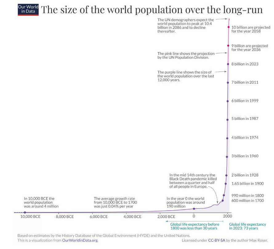
It is estimated that, in its entire history, 107 billion people have ever walked this Earth of ours.
Where do the people live? Habitat and geography
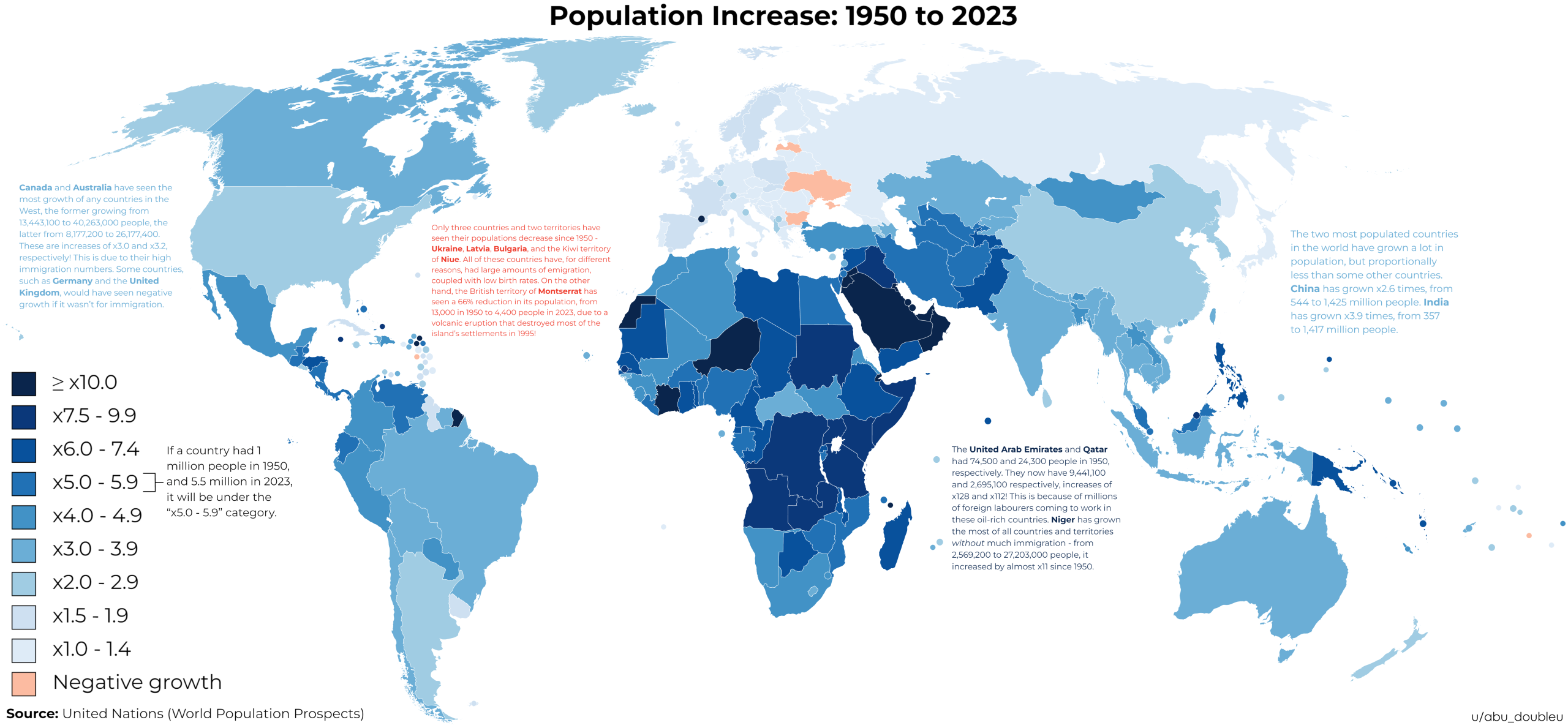
To consider the following illuminating chart (from Reddit, sourced from UN population prospects) on how the world has grown in population over the last 75 years or so.
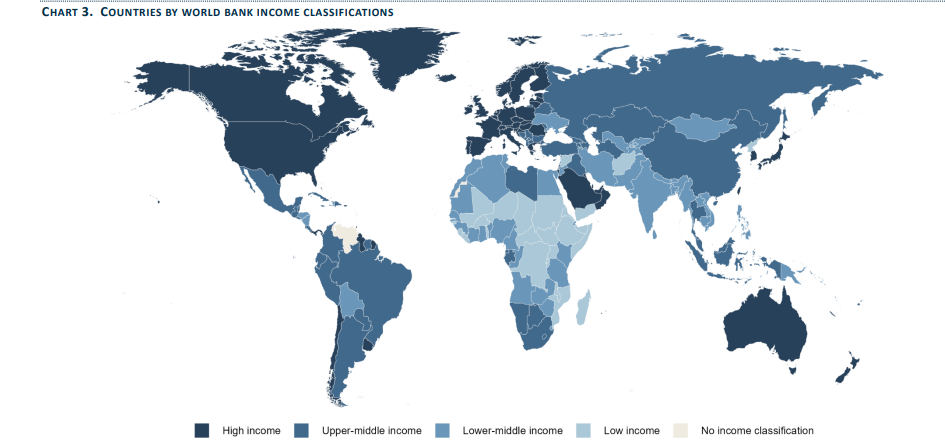
In the same breath, perhaps to mention the income distribution of this population.
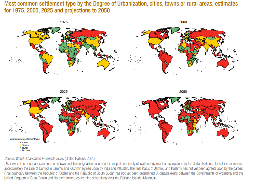
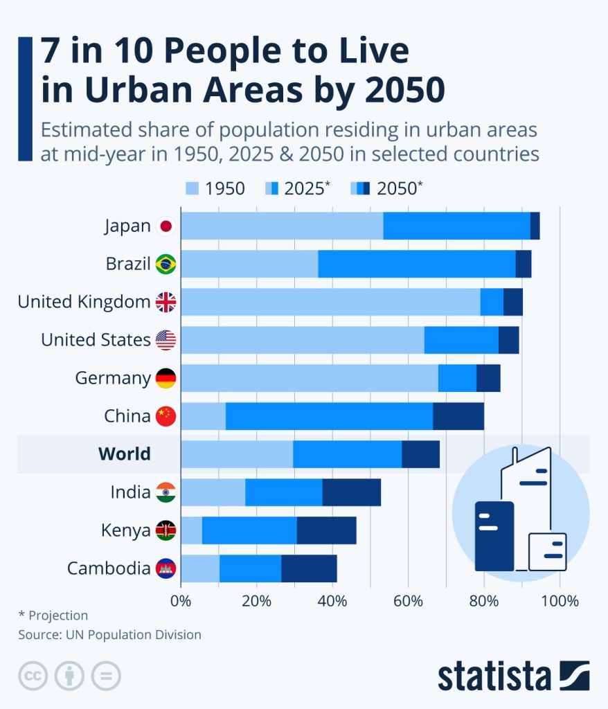
But one of the changing facts is the urbanisation of this population. A couple of charts to understand this better. By some estimates, the world crossed the urban rural divide in 2007, when more people were living in urban areas than rural areas. One history defining moment for humans.
To contemplate this further, consider this fascinating chart on human habitation
The shape of this population
Over time the shape of the population has changed, from the age structure, mortality, age expectation, geographical distribution.
Consider the following three charts on Fertility and Mortality Distributions. The left axis presents the total fertility rate of different countries, and the right axis the life expectancy at birth. These three charts from 1950, 2025 and 2100(e) show the dramatically changing clustering of different economies of the world
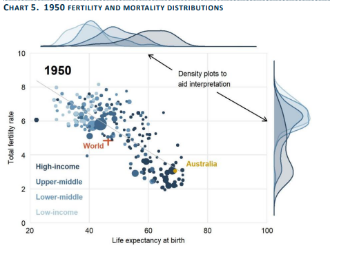
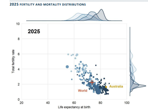
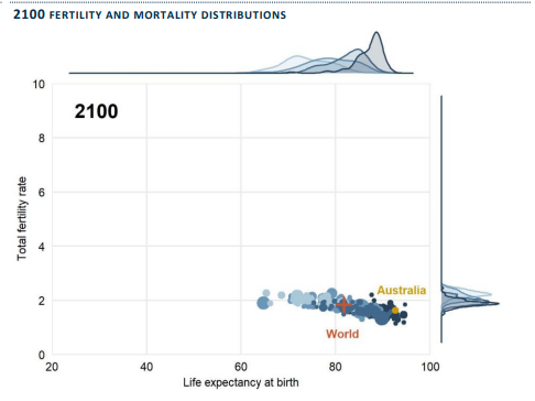
- Globally, life expectancy at birth reached 73.3 years in 2024, an increase of 8.4 years since 1995.
- Currently, the global fertility rate stands at 2.25 live births per woman,1 down from 3.31 births in 1990.
Resulting in the following shape of the population. Where soon, the world will have more older people (above 65 yrs) than children. Perhaps for the first time ever in human history.
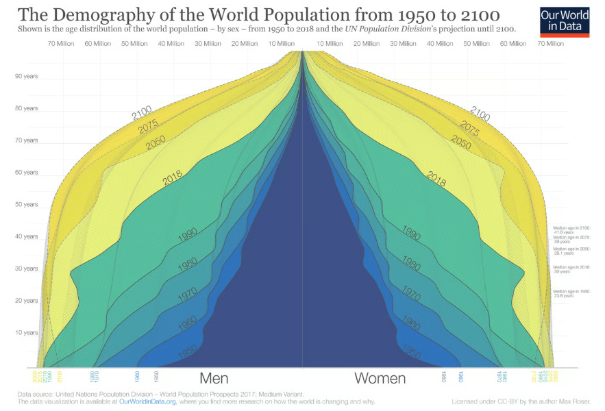
“We are at a turning point in global population history. Between 1950 and today, it was a widening of the entire pyramid – an increase in the number of children – that was responsible for the increase of the world population. From now on is not a widening of the base, but a ‘fill up’ of the population above the base: the number of children will barely increase and then start to decline, but the number of people of working age and old age will increase very substantially. As global health is improving and mortality is falling, the people alive today are expected to live longer than any generation before us.” – Our World in Data
To close
There are many takeaways from the above charts. What perhaps stands out for me is the mind-boggling growth of the century that is past, and of the peaking that is expected in the years to come, with both a box shape of population pyramid, and high concentrations in urban areas. All these are firsts in human history. The world changes significantly in front of our eyes. Not many ages get to see such change or grapple with its ramifications.
The big one amongst them is that how certain countries have grown much more in population, much unevenly than the rest of the world and how many of these countries are low income countries. Wish to explore this further with the sustainable development lens as well. (Perhaps in a future post). For now, these charts and a view of the world that is, and the changing dynamics.
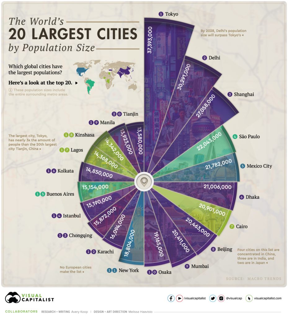
One final chart on the cities. Now the largest cities have more people living than population of some countries. This dynamic shapes a lot of the commercial world over the coming years. And if the world has to learn how to live well in cities, it will do well to learn from Japan which has not only one of the highest urban population, but also some of the largest urban centers and living reasonably well on the global scale of sustainable urban living.

A perspective on government finances – deficits and debt

AI, Data Centres and Copper – some notes